library(ggplot2)
library(dplyr)
#load a demo data set
data(mtcars)4 Plotting for data analysis

While R is often described as a ~niche programming language (e.g. for statistics and bioinformatics), it shines for data visualization compared to other data analysis appropriate mainstream alternatives like python and julia. A major reason for this distinction is the ggplot2 library and its support for the grammar of graphics, an expressive, composable and extensible way to build data visualizations.
4.1 ggplot2
The ggplot2 library supports rich combinations of graphical layers geoms, statistically derived layers, annotations, scales and aesthetic controls (just to name a few of its features).
Next lets spend some time learning how to prepare and plot our data using ggplot2. Check out more detailed examples.
Lets visualize the relationship between data features and miles per gallon mpg. First, lets pick and arbitrary variable and explore how it relates to mpg.
mtcars %>%
  ggplot(.,aes(x=cyl,y=mpg))
# # # # we could also assign our plot to some variable and add to it later
# p<-mtcars %>%
#   ggplot(.,aes(x=cyl,y=mpg))
#
# p # render plot
# p +
#   ggtitle('Descriptive title goes here')
The first layer loads the data and global aesthetics (aes). The aes are an expressive way to define which data columns are plotted as x, y coordinates, colors, size, groups, etc.
4.2 Scatter plot
This plot does not show anything yet because we have not defined any layers to show (e.g. points or lines). Lets create a scatter plot showing the points with x and y positions defined by two columns in the data.
mtcars %>%
  ggplot(.,aes(x=cyl,y=mpg)) +
  geom_point()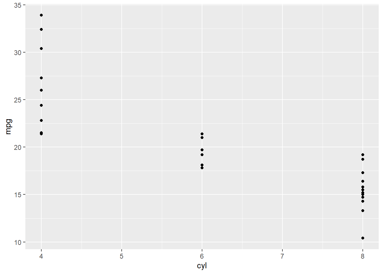
4.3 Box plot
Since we are plotting a categorical variable against a numeric variable, using a box plot might be more informative. We can also change the default theme of the global plot.
mtcars %>%
  ggplot(.,aes(x=cyl,y=mpg,group=cyl)) + # the group is used to define if we want to create a separate boxplot for each level in a column i.e. category
  geom_boxplot() +
  # facet_grid(am ~ vs) +
  # geom_violin() +
  theme_minimal()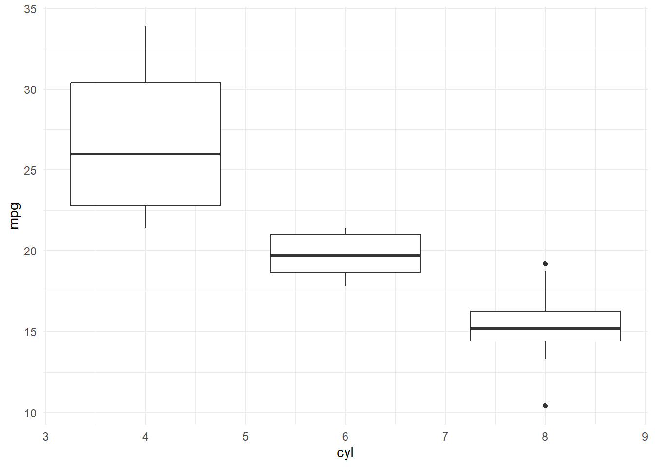
This is just the beginning of possibilities using ggplot2. 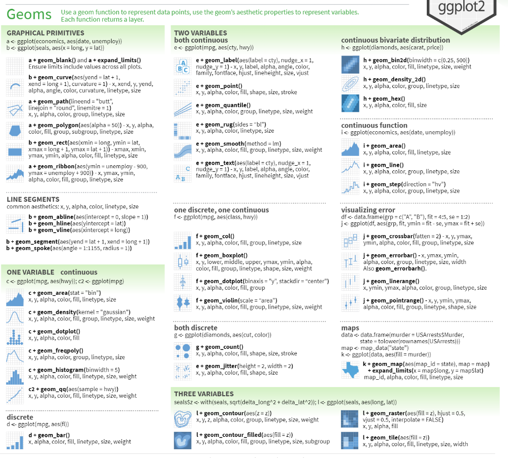
4.4 Heatmap
It might be interesting to quantify and plot how all variables are correlated with mpg. Lets calculate non-parametric spearman correlations and show the results as a heatmap. Note, many custom libraries exist just for this task (e.g. heatmaply).
corr<-cor(mtcars,method = "spearman")

#reshape the data into a 'melted' or long format
library(reshape2)
melted_corr <- melt(corr)
head(melted_corr)
Var1 Var2 value
1 mpg mpg 1.0000000
2 cyl mpg -0.9108013
3 disp mpg -0.9088824
4 hp mpg -0.8946646
5 drat mpg 0.6514555
6 wt mpg -0.8864220#plot
ggplot(data = melted_corr, aes(x=Var1, y=Var2, fill=value)) +
geom_tile()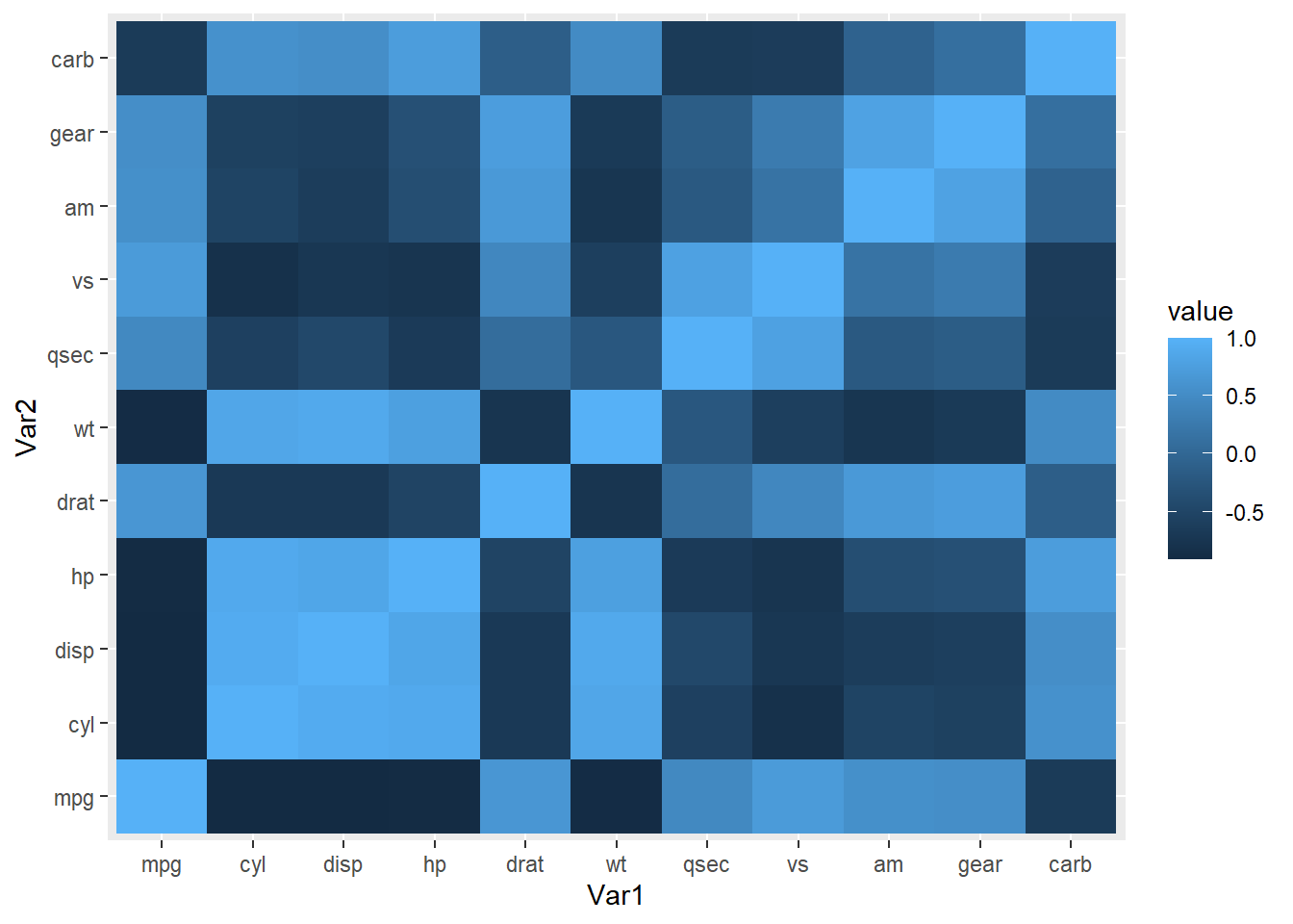
We could further improve visualization by only showing a portion of the symmetric matrix (e.g. upper triangle) and change the color scales to better highlight differences between positive and negative correlations (bonus: highlight correlations with p-value<= 0.05).
Lets show part of the square symmetric correlation matrix and improve the color scales.
#plot the upper triangle
corr[upper.tri(corr)]<-0# set to zero the opposite quadrant you want to show, the plot will flip the symmetric values
melted_corr<-melt(corr) # this a common operation when formatting data for complex plots

ggplot(data = melted_corr, aes(Var2, Var1, fill = value))+
 geom_tile(color = "white")+
 scale_fill_gradient2(low = "blue", high = "red", mid = "white", # specify color gradient
   midpoint = 0, limit = c(-1,1), space = "Lab",
   name="Spearman\nCorrelations") + #add color to the element legend. Note this can also be done more generically using ggtitle().
  theme_minimal()+
  # remove axis labels
  ylab('') +
  xlab('') +
 theme(axis.text.x = element_text(angle = 45, vjust = 1,
    size = 12, hjust = 1)) + #rotate x-axis labels 45 degrees
 coord_fixed()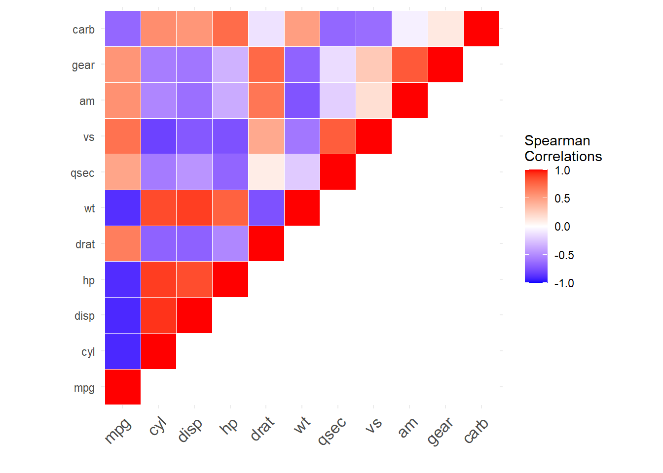
So far we have included numeric continuous variables and categorical ones in our visualization. It could be better only show correlations among continuous variables and show the categorical variable in a separate panel.
library(pheatmap)
library(purrr)

data<-mtcars

# we want to select categorical variables  for row meta data
# lets define this as any variables with n unique values <= some percent of the total data rows
x<-mtcars$gear
is_categorical<-function(x,cutoff=0.3){

  (length(unique(x))/ length(x)) <= cutoff

}


cat_cols<-sapply(mtcars,is_categorical) %>%
  names(.)[.]


#purrr::map archive similar goal to lapply
d2<-data %>%
  select(one_of(cat_cols)) %>%
  map(as.factor) %>%
  bind_rows()  %>%# alternative to do.call/cbind pattern
  data.frame()
#add row names for indexing
rownames(d2)<-rownames(data)

#create fake column metadata
d3<-data.frame(fake1 = rep(c('A','B'),length.out=ncol(data)))
rownames(d3)<-colnames(data)


pheatmap(
  data %>% select(-one_of(cat_cols)),
  annotation_row = d2,
  annotation_col = d3,
  cluster_cols = FALSE, # control clustering
  cluster_rows = FALSE # # control clustering
)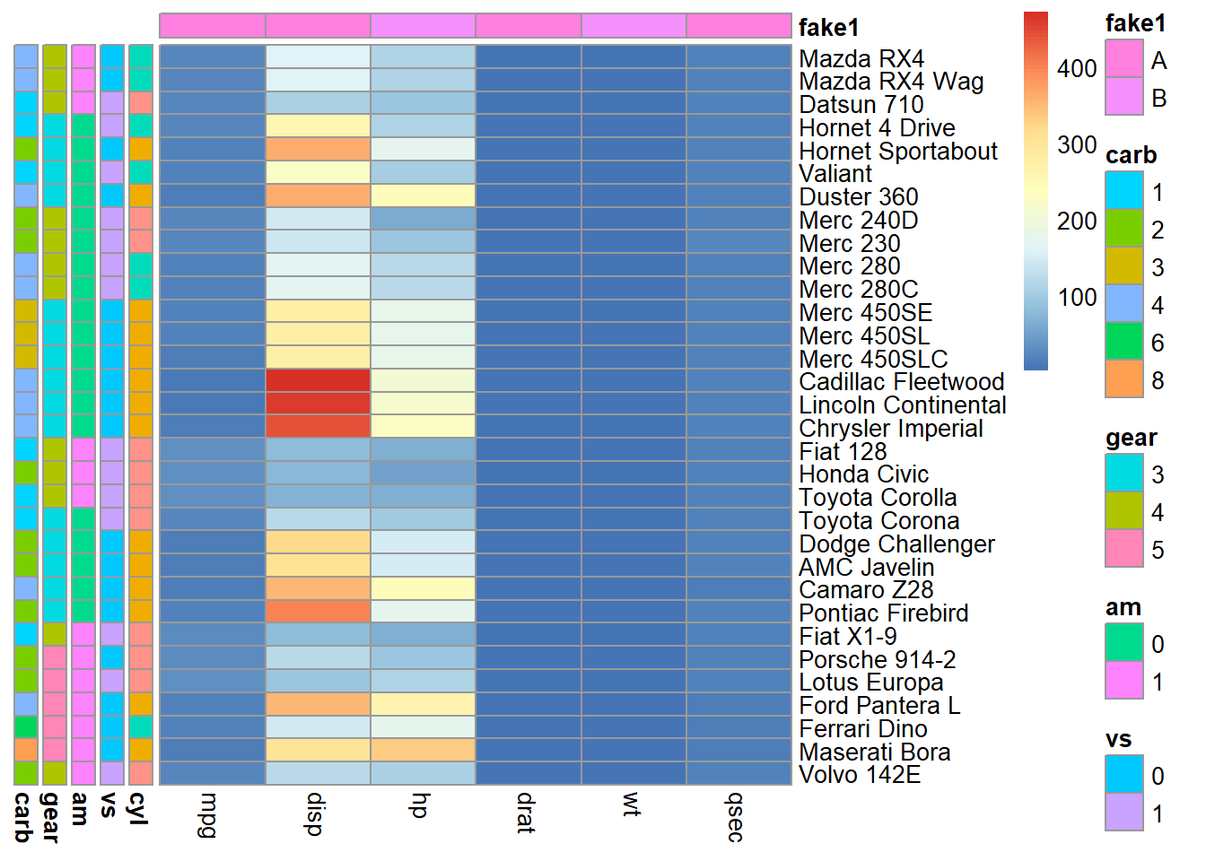
This is starting to look nice but we can better group related correlation patterns (i.e. sort the plot dimensions (rows and columns) based on similarity of patterns across all variable relationships). We can do this using hierarchical clustering. The simplest way to do this is using the heatmaply R library.
library(heatmaply)

corr<-cor(mtcars,method = "spearman")
### Let's Plot
heatmaply_cor(x = corr,
              xlab = "Features",
              ylab = "Features",
              k_col = 2,
              k_row = 2)
4.5 Plotly
One thing to notice is that the previous plot is interactive, which is achieved using the plotly library. We can convert any ggplot2 plot into an interactive plotly plot. Lets interactively explore another variable’s correlation with mpg.
library(plotly)

p<-mtcars %>%
  ggplot(.,aes(x=disp,y=mpg)) +
  stat_smooth(method = 'lm') + #show linear model fit
  stat_smooth(method = 'loess') + #loess model fit (non-linear)
  geom_point() +
  theme_minimal()

ggplotly(p)
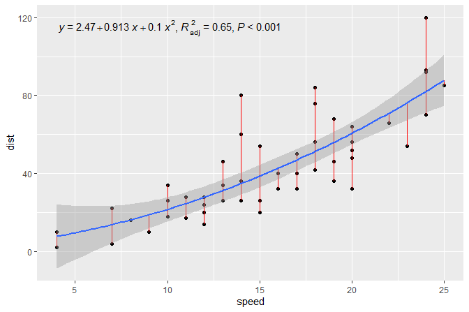
Note the ggpmisc library offers convenience functions to plot the model coefficients and variance explained (R^2). Note the figure below is not based on the mtcars data set.
4.6 Linear model
Next it might be interesting to visualize how cyl impacts the relationship between dispand mpg.
p<-mtcars %>%
  mutate(cyl=as.factor(cyl)) %>% # convert to a factor to create separate models an use categorical colors
  ggplot(.,aes(x=disp,y=mpg,color=cyl)) +
  stat_smooth(method = 'lm') + #show linear model fit
  geom_text(aes(label=rownames(mtcars))) +
  geom_point() +
  theme_minimal()

ggplotly(p)
This suggests that mpg is best explained by the combination of disp and cyl. We can check this by making our own linear model.
#model mpg given cyl
mod<-lm(mpg ~ disp ,data=mtcars) # note formula input
summary(mod)
Call:
lm(formula = mpg ~ disp, data = mtcars)

Residuals:
    Min      1Q  Median      3Q     Max
-4.8922 -2.2022 -0.9631  1.6272  7.2305

Coefficients:
             Estimate Std. Error t value Pr(>|t|)
(Intercept) 29.599855   1.229720  24.070  < 2e-16 ***
disp        -0.041215   0.004712  -8.747 9.38e-10 ***
---
Signif. codes:  0 '***' 0.001 '**' 0.01 '*' 0.05 '.' 0.1 ' ' 1

Residual standard error: 3.251 on 30 degrees of freedom
Multiple R-squared:  0.7183,    Adjusted R-squared:  0.709
F-statistic: 76.51 on 1 and 30 DF,  p-value: 9.38e-10
#model mpg given cyl, dsp and their interaction
mod2<-lm(mpg ~ disp + cyl + disp:cyl,data=mtcars)
summary(mod2)
Call:
lm(formula = mpg ~ disp + cyl + disp:cyl, data = mtcars)

Residuals:
    Min      1Q  Median      3Q     Max
-4.0809 -1.6054 -0.2948  1.0546  5.7981

Coefficients:
             Estimate Std. Error t value Pr(>|t|)
(Intercept) 49.037212   5.004636   9.798 1.51e-10 ***
disp        -0.145526   0.040002  -3.638 0.001099 **
cyl         -3.405244   0.840189  -4.053 0.000365 ***
disp:cyl     0.015854   0.004948   3.204 0.003369 **
---
Signif. codes:  0 '***' 0.001 '**' 0.01 '*' 0.05 '.' 0.1 ' ' 1

Residual standard error: 2.66 on 28 degrees of freedom
Multiple R-squared:  0.8241,    Adjusted R-squared:  0.8052
F-statistic: 43.72 on 3 and 28 DF,  p-value: 1.078e-10
#compare models
anova(mod, mod2, test="Chisq") # p-value denotes if the residual sum of squares are statistically significant (e.g. one model is better)Analysis of Variance Table
Model 1: mpg ~ disp
Model 2: mpg ~ disp + cyl + disp:cyl
Res.Df RSS Df Sum of Sq Pr(>Chi)
1 30 317.16
2 28 198.10 2 119.06 0.0002218 ***
---
Signif. codes: 0 '***' 0.001 '**' 0.01 '*' 0.05 '.' 0.1 ' ' 1We can compare all possible linear models.
summary(mod <- lm(mpg ~ ., data = mtcars))
Call:
lm(formula = mpg ~ ., data = mtcars)

Residuals:
    Min      1Q  Median      3Q     Max
-3.4506 -1.6044 -0.1196  1.2193  4.6271

Coefficients:
            Estimate Std. Error t value Pr(>|t|)
(Intercept) 12.30337   18.71788   0.657   0.5181
cyl         -0.11144    1.04502  -0.107   0.9161
disp         0.01334    0.01786   0.747   0.4635
hp          -0.02148    0.02177  -0.987   0.3350
drat         0.78711    1.63537   0.481   0.6353
wt          -3.71530    1.89441  -1.961   0.0633 .
qsec         0.82104    0.73084   1.123   0.2739
vs           0.31776    2.10451   0.151   0.8814
am           2.52023    2.05665   1.225   0.2340
gear         0.65541    1.49326   0.439   0.6652
carb        -0.19942    0.82875  -0.241   0.8122
---
Signif. codes:  0 '***' 0.001 '**' 0.01 '*' 0.05 '.' 0.1 ' ' 1

Residual standard error: 2.65 on 21 degrees of freedom
Multiple R-squared:  0.869, Adjusted R-squared:  0.8066
F-statistic: 13.93 on 10 and 21 DF,  p-value: 3.793e-07
smod <- step(mod,direction = 'both')Start: AIC=70.9
mpg ~ cyl + disp + hp + drat + wt + qsec + vs + am + gear + carb
Df Sum of Sq RSS AIC
- cyl 1 0.0799 147.57 68.915
- vs 1 0.1601 147.66 68.932
- carb 1 0.4067 147.90 68.986
- gear 1 1.3531 148.85 69.190
- drat 1 1.6270 149.12 69.249
- disp 1 3.9167 151.41 69.736
- hp 1 6.8399 154.33 70.348
- qsec 1 8.8641 156.36 70.765
<none> 147.49 70.898
- am 1 10.5467 158.04 71.108
- wt 1 27.0144 174.51 74.280
Step: AIC=68.92
mpg ~ disp + hp + drat + wt + qsec + vs + am + gear + carb
Df Sum of Sq RSS AIC
- vs 1 0.2685 147.84 66.973
- carb 1 0.5201 148.09 67.028
- gear 1 1.8211 149.40 67.308
- drat 1 1.9826 149.56 67.342
- disp 1 3.9009 151.47 67.750
- hp 1 7.3632 154.94 68.473
<none> 147.57 68.915
- qsec 1 10.0933 157.67 69.032
- am 1 11.8359 159.41 69.384
+ cyl 1 0.0799 147.49 70.898
- wt 1 27.0280 174.60 72.297
Step: AIC=66.97
mpg ~ disp + hp + drat + wt + qsec + am + gear + carb
Df Sum of Sq RSS AIC
- carb 1 0.6855 148.53 65.121
- gear 1 2.1437 149.99 65.434
- drat 1 2.2139 150.06 65.449
- disp 1 3.6467 151.49 65.753
- hp 1 7.1060 154.95 66.475
<none> 147.84 66.973
- am 1 11.5694 159.41 67.384
- qsec 1 15.6830 163.53 68.200
+ vs 1 0.2685 147.57 68.915
+ cyl 1 0.1883 147.66 68.932
- wt 1 27.3799 175.22 70.410
Step: AIC=65.12
mpg ~ disp + hp + drat + wt + qsec + am + gear
Df Sum of Sq RSS AIC
- gear 1 1.565 150.09 63.457
- drat 1 1.932 150.46 63.535
<none> 148.53 65.121
- disp 1 10.110 158.64 65.229
- am 1 12.323 160.85 65.672
- hp 1 14.826 163.35 66.166
+ carb 1 0.685 147.84 66.973
+ vs 1 0.434 148.09 67.028
+ cyl 1 0.414 148.11 67.032
- qsec 1 26.408 174.94 68.358
- wt 1 69.127 217.66 75.350
Step: AIC=63.46
mpg ~ disp + hp + drat + wt + qsec + am
Df Sum of Sq RSS AIC
- drat 1 3.345 153.44 62.162
- disp 1 8.545 158.64 63.229
<none> 150.09 63.457
- hp 1 13.285 163.38 64.171
+ gear 1 1.565 148.53 65.121
+ cyl 1 1.003 149.09 65.242
+ vs 1 0.645 149.45 65.319
+ carb 1 0.107 149.99 65.434
- am 1 20.036 170.13 65.466
- qsec 1 25.574 175.67 66.491
- wt 1 67.572 217.66 73.351
Step: AIC=62.16
mpg ~ disp + hp + wt + qsec + am
Df Sum of Sq RSS AIC
- disp 1 6.629 160.07 61.515
<none> 153.44 62.162
- hp 1 12.572 166.01 62.682
+ drat 1 3.345 150.09 63.457
+ gear 1 2.977 150.46 63.535
+ cyl 1 2.447 150.99 63.648
+ vs 1 1.121 152.32 63.927
+ carb 1 0.011 153.43 64.160
- qsec 1 26.470 179.91 65.255
- am 1 32.198 185.63 66.258
- wt 1 69.043 222.48 72.051
Step: AIC=61.52
mpg ~ hp + wt + qsec + am
Df Sum of Sq RSS AIC
- hp 1 9.219 169.29 61.307
<none> 160.07 61.515
+ disp 1 6.629 153.44 62.162
+ carb 1 3.227 156.84 62.864
+ drat 1 1.428 158.64 63.229
- qsec 1 20.225 180.29 63.323
+ cyl 1 0.249 159.82 63.465
+ vs 1 0.249 159.82 63.466
+ gear 1 0.171 159.90 63.481
- am 1 25.993 186.06 64.331
- wt 1 78.494 238.56 72.284
Step: AIC=61.31
mpg ~ wt + qsec + am
Df Sum of Sq RSS AIC
<none> 169.29 61.307
+ hp 1 9.219 160.07 61.515
+ carb 1 8.036 161.25 61.751
+ disp 1 3.276 166.01 62.682
+ cyl 1 1.501 167.78 63.022
+ drat 1 1.400 167.89 63.042
+ gear 1 0.123 169.16 63.284
+ vs 1 0.000 169.29 63.307
- am 1 26.178 195.46 63.908
- qsec 1 109.034 278.32 75.217
- wt 1 183.347 352.63 82.790summary(smod)
Call:
lm(formula = mpg ~ wt + qsec + am, data = mtcars)

Residuals:
    Min      1Q  Median      3Q     Max
-3.4811 -1.5555 -0.7257  1.4110  4.6610

Coefficients:
            Estimate Std. Error t value Pr(>|t|)
(Intercept)   9.6178     6.9596   1.382 0.177915
wt           -3.9165     0.7112  -5.507 6.95e-06 ***
qsec          1.2259     0.2887   4.247 0.000216 ***
am            2.9358     1.4109   2.081 0.046716 *
---
Signif. codes:  0 '***' 0.001 '**' 0.01 '*' 0.05 '.' 0.1 ' ' 1

Residual standard error: 2.459 on 28 degrees of freedom
Multiple R-squared:  0.8497,    Adjusted R-squared:  0.8336
F-statistic: 52.75 on 3 and 28 DF,  p-value: 1.21e-11
4.7 Model optimization
This a great data driven approach to hone in on the important variables to explain an objective of interest. Lets tune a scatter plot to best show the optimal model insights. We can use the model coefficient weights to prioritize what we show in the different layers. Lets first take a closer look at the variables.
mtcars %>%
  select(one_of(c('mpg','wt','qsec','am'))) %>%
  head()# we can see am should be categorical
mpg wt qsec am
Mazda RX4 21.0 2.620 16.46 1
Mazda RX4 Wag 21.0 2.875 17.02 1
Datsun 710 22.8 2.320 18.61 1
Hornet 4 Drive 21.4 3.215 19.44 0
Hornet Sportabout 18.7 3.440 17.02 0
Valiant 18.1 3.460 20.22 0Looking at the variable types and levels in each category is helpful to decide which aes is best suited to visualize each dimension.
mtcars %>%
 ggplot(.,aes(x=wt,y=mpg,size=qsec)) +
  geom_point() +
  facet_grid(.~am) + # create subplots as columns 9or rows e.g. 'am~.'
  stat_smooth(method='lm',show.legend = FALSE) +
  theme_minimal()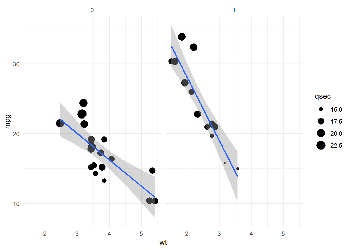
4.7.1 Scatter plot matrix
We can visualize all bivariate variable relationships using a scatter plot matrix.
library(GGally)
library(plotly)
data<-mtcars %>%
  select(one_of(c('mpg','wt','qsec','am'))) %>%
  mutate(am=as.factor(am))

p <- ggpairs(data, ggplot2::aes(colour=am) )

ggplotly(p)
Visualizing multivariate model term relationships can be useful to fine tune model interaction terms.
mod3<-lm(mpg ~ wt * am * qsec, data=mtcars)
summary(mod3)
Call:
lm(formula = mpg ~ wt * am * qsec, data = mtcars)

Residuals:
    Min      1Q  Median      3Q     Max
-3.3330 -1.4729 -0.4856  1.1495  4.0045

Coefficients:
            Estimate Std. Error t value Pr(>|t|)
(Intercept) -11.8073    57.7960  -0.204    0.840
wt            3.8670    17.0915   0.226    0.823
am           -5.5842    65.4915  -0.085    0.933
qsec          2.2148     3.1734   0.698    0.492
wt:am         4.0906    20.5487   0.199    0.844
wt:qsec      -0.3805     0.9467  -0.402    0.691
am:qsec       1.1768     3.6310   0.324    0.749
wt:am:qsec   -0.5009     1.1648  -0.430    0.671

Residual standard error: 2.123 on 24 degrees of freedom
Multiple R-squared:  0.904, Adjusted R-squared:  0.8759
F-statistic: 32.27 on 7 and 24 DF,  p-value: 1.027e-10
When we see a better fitting model based on Adjusted R-squared it is useful to consider the ~stability of the model coefficients. We can do this by comparing the coefficient weight relative to its standard deviation. We can do this based on the variance inflation factor.
library(car)
(mod3_vif<-vif(mod3))
wt am qsec wt:am wt:qsec am:qsec wt:am:qsec
1924.0248 7347.2244 221.2218 4632.5795 1873.1026 6918.8239 4169.4921 (smod_vif<-vif(smod)) wt qsec am
2.482952 1.364339 2.541437 Model parameter weights with high vif suggest small changes in future data (e.g. another data set) will greatly influence the model predictions. While this is an exercise for another time, one could undertake it by sampling from the original data and adding some error to create synthetic test data then comparing predictions of mpg given this data between different models.
4.7.2 Dumbbell plot
Lastly lets use the skills we learned so far to visualize the individual model vif values. One idea could be to create a dumbbell plot comparing two model’s values.
library(ggplot2)
library(ggalt)
theme_set(theme_minimal()) # set theme globaly

#we need to extract the model coefficient and join them together
d1<-smod_vif %>%
  data.frame(term=names(.),vif1=.)
d2<-mod3_vif %>%
  data.frame(term=names(.),vif2=.)


#we want to create two columns, one for each model's vif, for all terms
library(dplyr)
data<-data.frame(term=c(d1$term,d2$term) %>% unique()) %>%
  left_join(d1,by='term') %>%
  full_join(d2,by='term') # left_join also works

#fix NA in model missing terms. Note this obfuscates which terms are presnt in the model.
data[is.na(data)]<-0

gg <- ggplot(data, aes(x=vif1, xend=vif2, y=term, group=term)) +
        geom_dumbbell(color="#a3c4dc",
                      size=0.75)
plot(gg)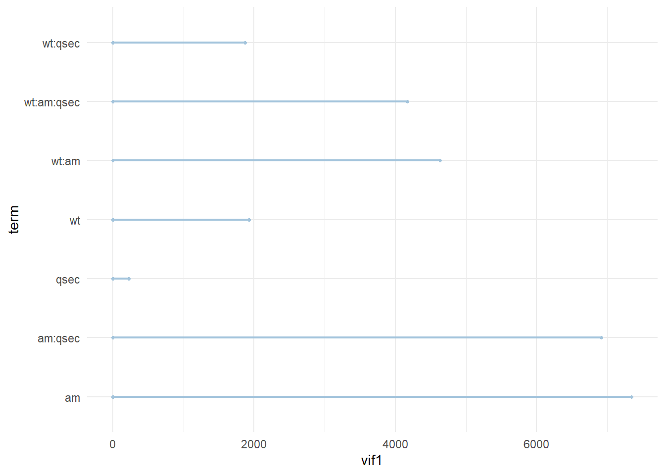
4.7.3 Bar chart
Alternatively we can make a bar chart to compare model vif.
#we need to extract the model coefficient and join them together
d1<-smod_vif %>%
  data.frame(term=names(.),vif=.)
d2<-mod3_vif %>%
  data.frame(term=names(.),vif=.)


#we want to create two columns, one for each model's vif, for all terms
#join ~combines data frame by matching a common row index (e.g. term here)
data<-data.frame(term=c(d1$term,d2$term) %>% unique()) %>%
  left_join(d1,by='term') %>%
  left_join(d2,by='term')


data<-melt(data,id.vars=c('term'))

ggplot(data,aes(x=term, y=value,fill=variable,group=variable)) +
  scale_y_log10() +
  geom_bar(stat="identity",position=position_dodge()) +
  scale_fill_discrete(name = "model", labels = c('smod','mod3')) # custom legend titles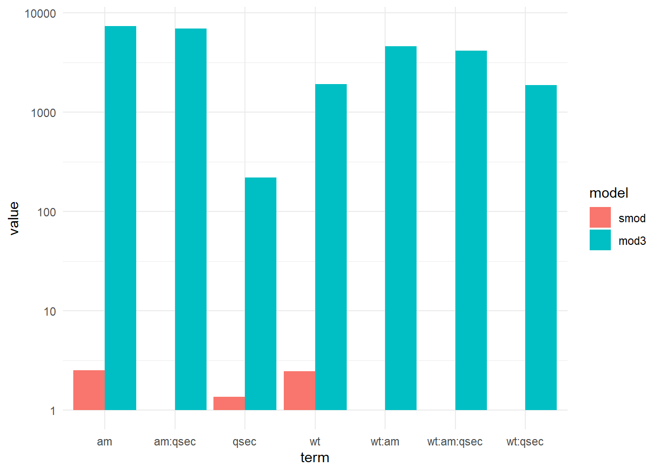
4.7.4 Simulation
Next lets test how predictive our models are based on synthetic data. Lets use a simple strategy to simulate data for each categorical variable based on the original data column mean + standard deviations * error.
#Note you can use the short cut 'shift+ctrl+alt +R' (when in a function) to initialize Roxygen documentation

#' Title
#'
#' @param data data frame of numeric values. Note, need to add special handling for characters or factors.
#' @param error error in units of standard deviation
#'
#' @return data frame of simulate data based on sampling from the normal distribution
#' @export
#'
#' @examples
simulate_data<-function(data,error=1,y=NULL){

  #loop over each column in and simulate n rows base original column mean and error
  out<-lapply(data, function(x){
    .mean<-mean(x,na.rm=TRUE)
    .sd<-sd(x,na.rm=TRUE)
    rnorm(nrow(data),.mean,.sd*error)

  }) %>%
    do.call('cbind',.)

  #note we might not want to add error to out objective
  if(!is.null(y)){
    out[,y]<-data[,y]
  }

  #add row names
  row.names(out)<-rownames(data)


  out
}

#test - note this does not handle categorical data correctly
# simulate_data(mtcars)

#a simple fix is to simulate data for each categorical variable separately
library(tidyr)
group<-c('am','vs','cyl','gear')
data<-mtcars %>%
  unite(., 'group',group,remove=FALSE)

tmp<-data %>% split(.,data$group)
sim_data<-lapply(tmp,function(x){
  simulate_data(data = x %>% select(-group))

}) %>%
  do.call('rbind',.) %>%
  na.omit() %>%
  data.frame()

head(sim_data)
mpg cyl disp hp drat wt qsec vs
Hornet Sportabout 15.92131 8 361.6189 270.9423 3.217551 2.559463 16.74392 0
Duster 360 18.22606 8 306.7162 181.8570 3.226596 3.529210 17.12726 0
Merc 450SE 14.16836 8 220.5610 190.0633 3.160627 3.667531 17.76267 0
Merc 450SL 16.61274 8 307.8861 231.1783 3.141670 3.851995 16.66151 0
Merc 450SLC 15.01236 8 418.1219 213.4172 2.983603 4.614786 17.14607 0
Cadillac Fleetwood 16.80138 8 192.4512 145.7386 3.273647 3.936331 17.10656 0
am gear carb
Hornet Sportabout 0 3 0.3408265
Duster 360 0 3 4.3707222
Merc 450SE 0 3 3.6192649
Merc 450SL 0 3 2.9182297
Merc 450SLC 0 3 3.5525654
Cadillac Fleetwood 0 3 4.9797846#don't add error to y
sim_data2<-lapply(tmp,function(x){
simulate_data(data = x %>% select(-group),y='mpg')
}) %>%
do.call('rbind',.) %>%
na.omit() %>%
data.frame()
# #note see which groups we lost
# dim(sim_data)
# dim(mtcars)4.7.5 Prediction
Predict mpg for the simulated data and compare model error.
pred1<-predict(mod3,sim_data)
pred2<-predict(smod,sim_data)

#calculate error in original units of y - Root mean squared error (RMSE)
library(Metrics)

y<-'mpg'
pred1_RMSE<-rmse(sim_data[,y,drop=TRUE],pred1 )
pred2_RMSE<-rmse(sim_data[,y,drop=TRUE],pred2 )

# error in y
data.frame(model=c('mod3','smod'),RMSE=c(pred1_RMSE,pred2_RMSE))
model RMSE
1 mod3 3.875737
2 smod 3.901471# no error in y
pred1<-predict(mod3,sim_data2)
pred2<-predict(smod,sim_data2)
pred1_RMSE<-rmse(sim_data2[,y,drop=TRUE],pred1 )
pred2_RMSE<-rmse(sim_data2[,y,drop=TRUE],pred2 )
data.frame(model=c('mod3','smod'),RMSE=c(pred1_RMSE,pred2_RMSE)) model RMSE
1 mod3 2.969335
2 smod 3.0584014.7.6 Model diagnostics
A useful analysis is to visualize the model residuals vs the actual values.
library(ggrepel) # improved text plotting
residual<-{sim_data[,y,drop=TRUE]- pred1} %>% # absolute value
  data.frame(actual=sim_data[,y,drop=TRUE],residual=.,row_name=row.names(sim_data))

resid_plot<-ggplot(residual, aes(x=actual,y=residual)) +
  geom_point() +
  stat_smooth(color='gray') +
  geom_text_repel(aes(label=row_name))

resid_plot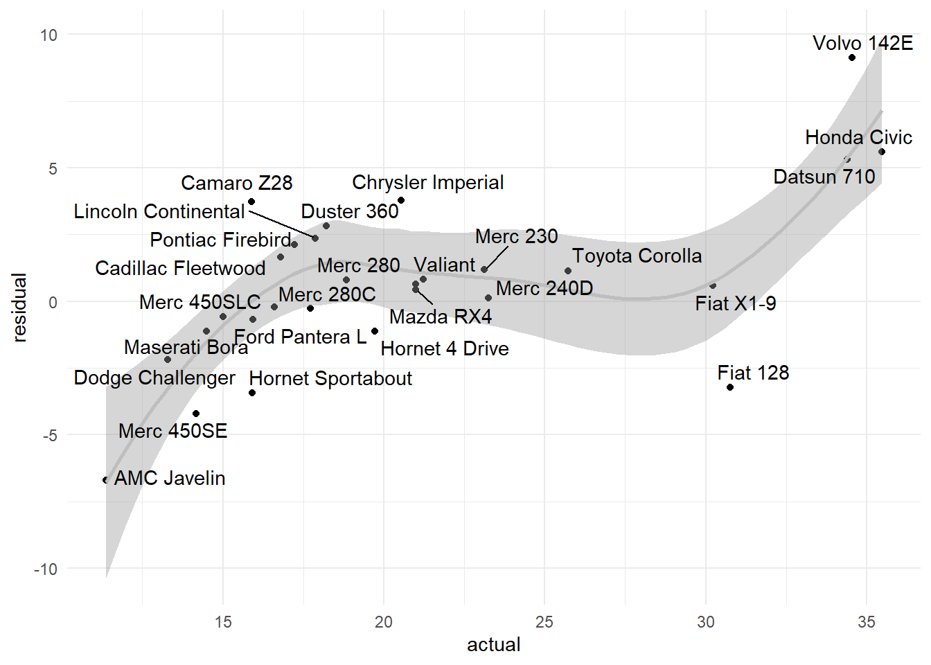
We can also plot the predicted vs the actual values for each group of the simulated data.
predicted<-predict(mod3,sim_data)


#add group info
group<-c('am','vs','cyl','gear')
data<-sim_data %>%
  unite(., 'group',group,remove=FALSE) %>%
  mutate(row_name=rownames(sim_data),predicted=predicted )


pred_plot<-ggplot(data, aes(y = mpg, x =predicted)) +
  geom_point(aes(color = group), size = 3) +
  stat_smooth(method = 'lm', color = 'gray') +
  geom_text_repel(aes(label = row_name, color = group), show.legend = FALSE) +
  scale_color_discrete(name = paste(group, collapse = '_')) +
  geom_abline(slope = 1,intercept = 0,linetype='dashed')  #line if predicted and actual perfectly matched

pred_plot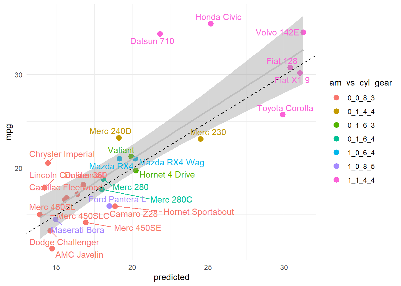
Finally we could compare the density distributions and test for significant differences in model predictions.
#we want to plot the difference from the true vs. predicted value, residual
resid1<-abs(sim_data[,y,drop=TRUE]-pred1) %>% # absolute value
  data.frame(model='mod3',residual=.)
resid2<-abs(sim_data2[,y,drop=TRUE]-pred2) %>% # absolute value
  data.frame(model='smod',residual=.)

data<-rbind(resid1,resid2)

cols <- c("#F76D5E", "#72D8FF") # custom colors as hex codes

# Density areas without lines
dist_plot<-ggplot(data, aes(x = residual, fill = model)) +
  geom_density(alpha = 0.8, color = NA) +  # color is the border
  scale_fill_manual(values = cols) # set custom colors

dist_plot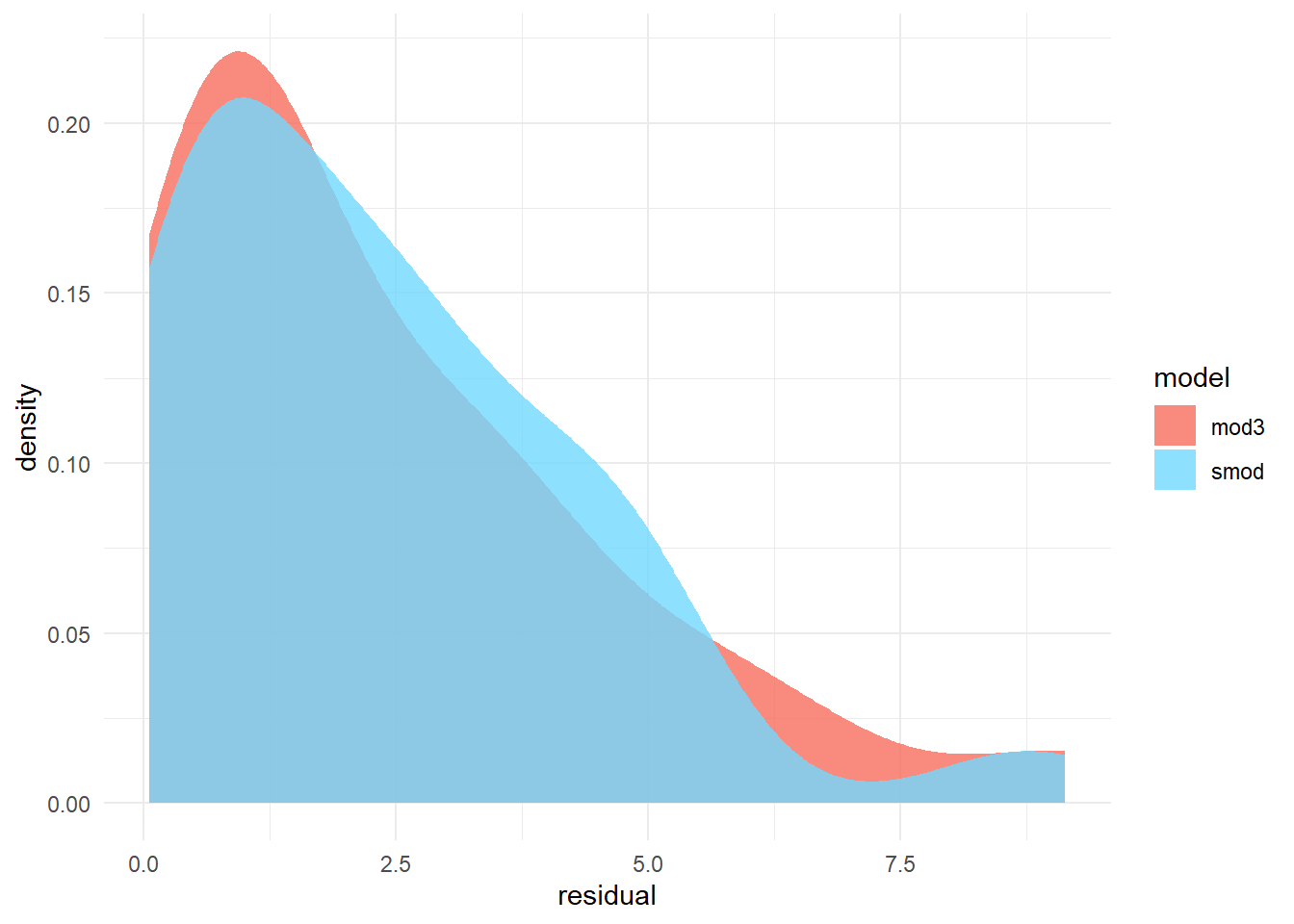
Test for difference in model errors.
t.test(resid1$residual,resid2$residual) # note we may want to test the shifted log (i.e. log(x+10)) of the residuals to make them normal or use a non-parametric test
    Welch Two Sample t-test

data:  resid1$residual and resid2$residual
t = 0.044789, df = 53.456, p-value = 0.9644
alternative hypothesis: true difference in means is not equal to 0
95 percent confidence interval:
 -1.114467  1.165387
sample estimates:
mean of x mean of y
 2.356051  2.330591
Based on this analysis we can conclude the smaller model (i.e. less terms) is not significantly different from the model with more terms. In practice we want to proceed with interpreting the simplest model with the lowest error.
4.8 Combining multiple plots
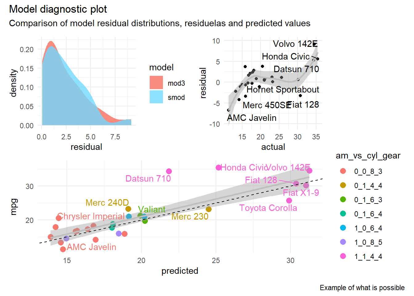
The pathchwork R library makes it easy to combine multiple plots using a variety of custom layouts. Combining plots is as easy as creating individual plots and then defining how they should be combined to create a single visualization based on their layout and position (e.g. in rows and/or columns).
library(patchwork)


patchwork <- (dist_plot + resid_plot) / pred_plot
patchwork + plot_annotation(
  title = 'Model diagnostic plot',
  subtitle = 'Comparison of model residual distributions, residuelas and predicted values',
  caption = 'Example of what is possible'
)
4.9 Interactive plotting
There are a variety of apps providing user interfaces to interactively build ggplot2 plots. For example esquisse.
# install.packages("esquisse")
library('esquisse')

esquisse::esquisser(mtcars)